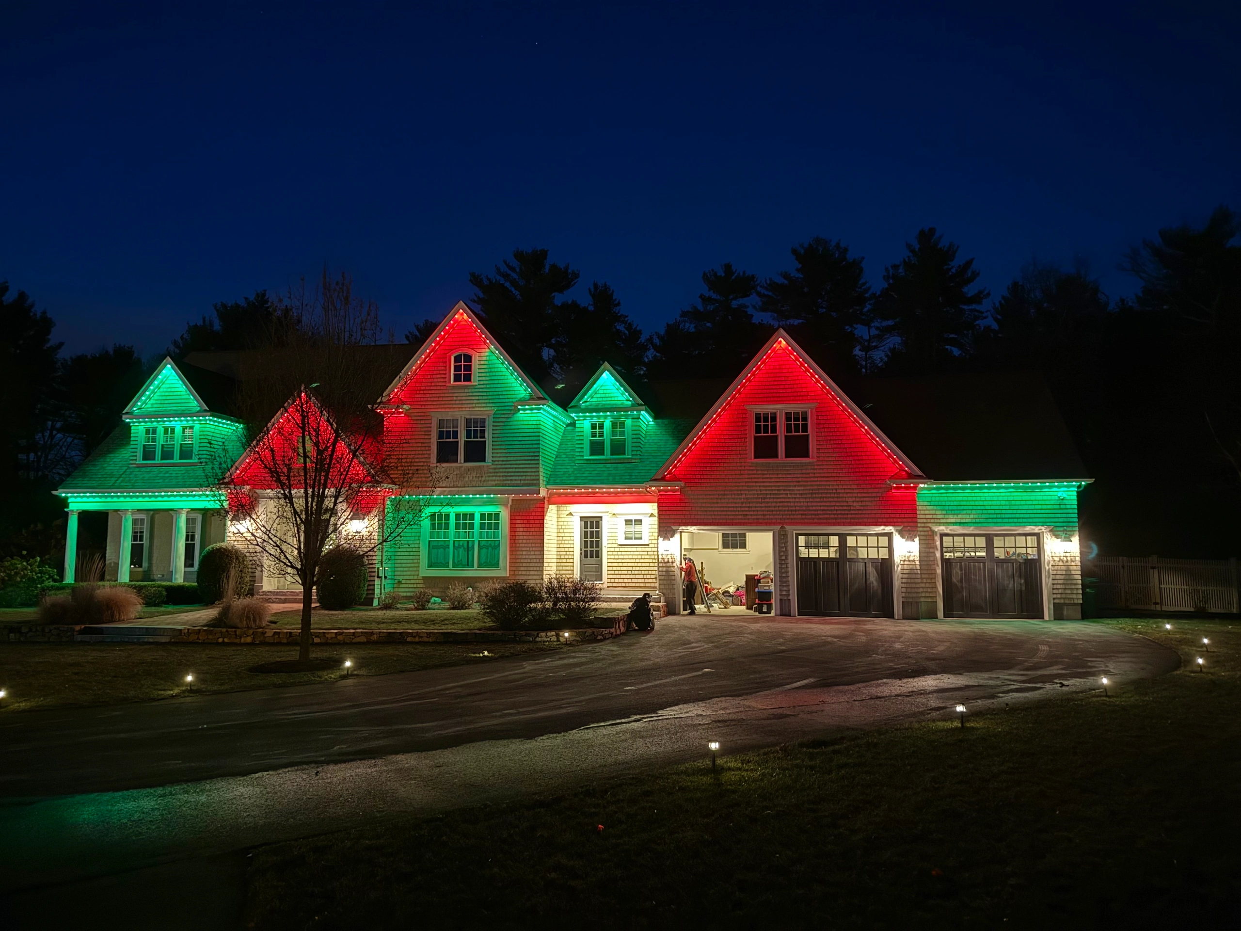

You’ve seen it on an evening walk through the neighborhood. One home glows — the stone looks rich, the trees feel alive, the whole property invites you in. The house next door has the same fixtures in roughly the same places, yet it looks flat, blue, almost like a parking lot. The difference is rarely the fixtures or even where they’re aimed. It’s the color of the light.
Color temperature is the single most overlooked decision in outdoor lighting, and it’s the one that quietly separates a home that looks designed from one that looks merely lit.
What “Color Temperature” Actually Means
Color temperature describes how warm or cool a light appears, measured on the Kelvin (K) scale. Lower numbers are warmer and more amber, like candlelight or a sunset. Higher numbers are cooler and bluer, like midday sun or a hospital hallway. A candle sits around 1800K. A traditional incandescent bulb glows near 2700K. Daylight climbs to 5000K and beyond.
The number printed on a bulb’s box has nothing to do with brightness — a warm light and a cool light can be exactly as bright. They simply set entirely different moods.
The Number to Remember: 2700K
For residential outdoor lighting, the answer is almost always 2700K — a soft, warm white that reads as inviting rather than harsh. It flatters natural materials, deepens the color of foliage, and turns an exterior into something you want to linger in.
Some designers step up to 3000K for a slightly crisper, cleaner white, particularly on very modern architecture or contemporary hardscape. That’s a considered choice, not a default. Anything above 3000K outdoors begins to feel clinical, and the warmth that makes an evening landscape feel intimate disappears.
The number to know: 2700K — warm white, inviting, and the standard for professionally designed residential outdoor lighting.
The Color to Avoid at Night: Cool White and Blue
If there’s one thing to avoid, it’s cool white and daylight-toned light — roughly 4000K and up. This is the bluish glare you see in security floodlights and big-box-store fixtures, and it does to a beautiful home exactly what fluorescent light does to a beautiful room: it drains the warmth out of it.
Cool light also reads as harsh and slightly aggressive at night, the opposite of the welcome a well-lit home is meant to offer. It’s the visual signature of lighting that was installed to be bright, rather than designed to be beautiful.
Why Warm Light Flatters a Home
Warm light works in your favor because it’s the color the eye already associates with comfort — firelight, lamplight, sunset. Against that warmth, brick and stone glow rather than gray out, wood siding looks rich, and greenery reads as lush instead of washed out. Skin tones look natural too, which matters the moment you’re entertaining on a patio or greeting guests at the door.
Cool light does none of this. It tends to flatten texture and mute the very materials that give a home its character after dark.
The Detail Most People Miss: Consistency
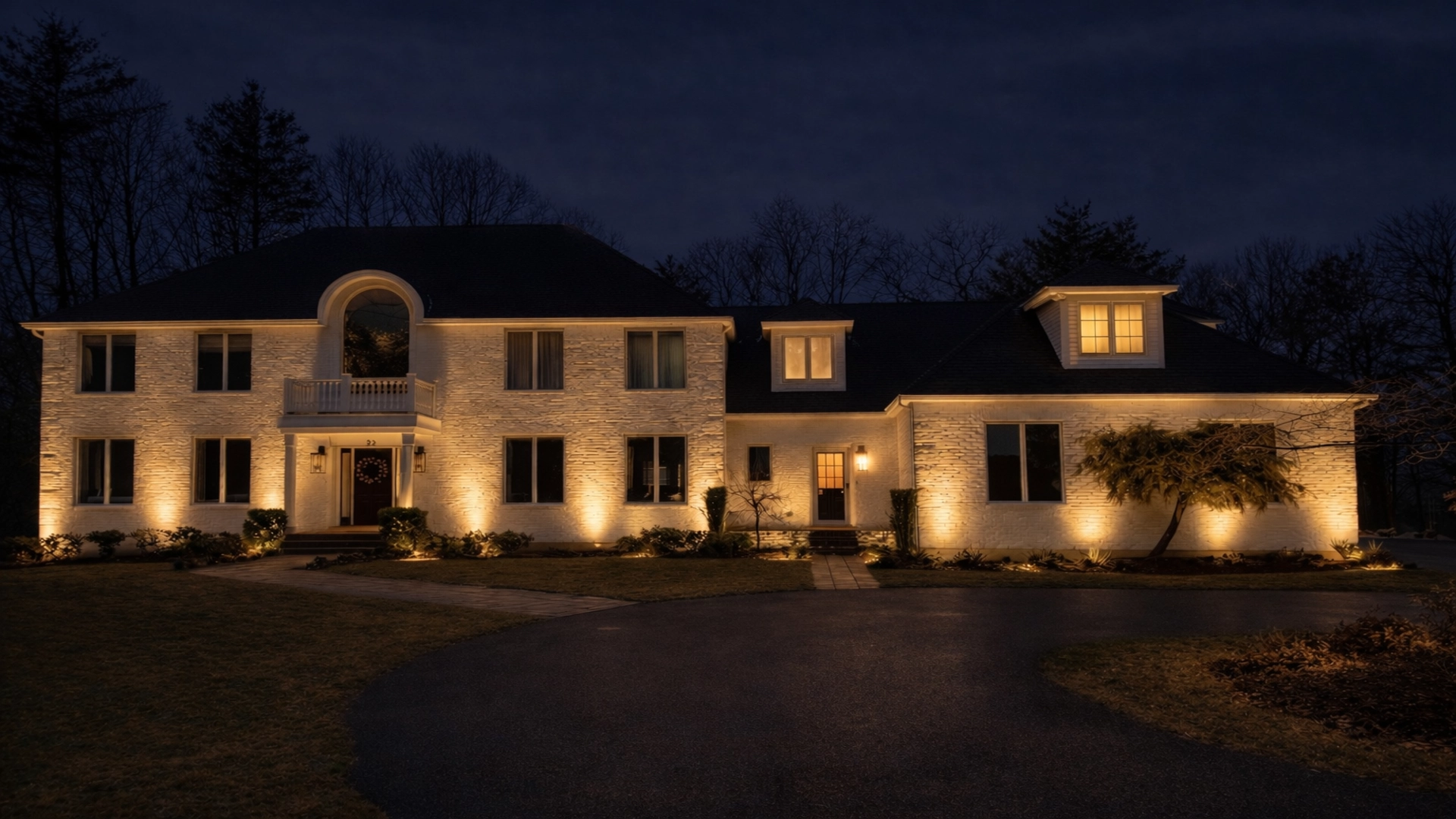
Even with the right temperature, one mistake gives away an amateur installation faster than any other: mismatched color across fixtures. Bulbs bought at different times, from different brands, or in slightly different temperatures turn a property into a patchwork — one path light slightly pink, the next slightly blue, the facade a different shade again.
A designed lighting system uses a single, consistent color temperature across every fixture, so the eye reads the whole property as one calm, intentional scene. Consistency is invisible when it’s right and impossible to ignore when it’s wrong.
One More Number That Matters: CRI
Color temperature gets the attention, but there’s a second number worth knowing: Color Rendering Index, or CRI. CRI measures how accurately a light reveals the true color of what it falls on, on a scale to 100. A low-CRI light can be the perfect warmth and still make your garden’s reds and greens look dull and lifeless.
Quality outdoor fixtures use a CRI of 90 or above, so the materials and plantings you’ve invested in actually look the way they should after sunset. It’s the difference between light that’s merely present and light that’s flattering.
Where Getting the Warmth Right Matters Most
Stone and architecture
Warm light brings out the natural variation in stone, brick, and masonry. Cool light flattens it into a single gray tone.
Trees and gardens
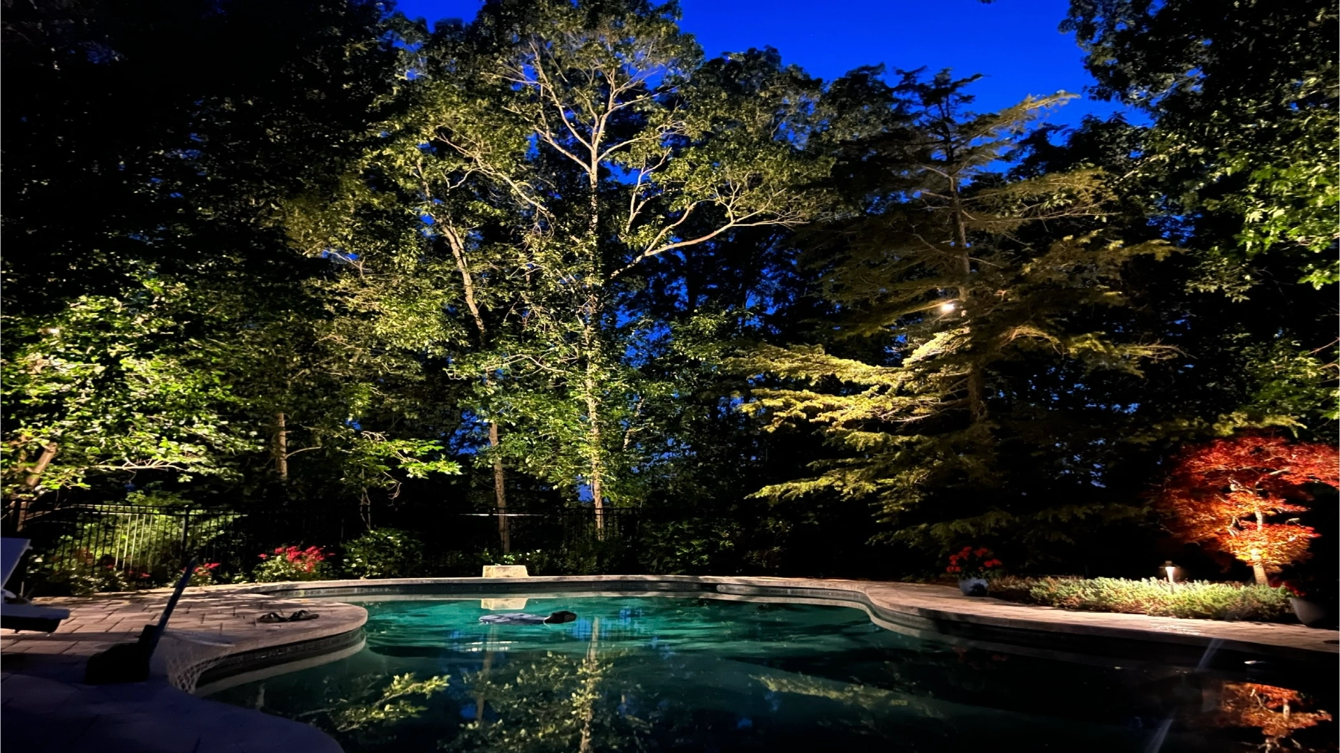
A consistent warm tone makes foliage feel rich and full at night. It’s also far kinder to the surrounding darkness than blue-white glare, which scatters and spills.
Water features
Warm, well-rendered light gives water depth and movement. Cool light makes it look cold and lifeless — exactly the wrong feeling for a feature meant to relax.
Gathering spaces
Patios, porches, and outdoor dining areas are where warmth matters most. This is where people gather, and where the right color temperature quietly tells everyone to slow down and stay.
Frequently Asked Questions
What color temperature is best for outdoor lighting?
For residential outdoor and landscape lighting, 2700K is the standard — a warm white that feels inviting and flatters natural materials. Some modern homes use 3000K for a slightly crisper white. Anything cooler tends to look harsh.
What color light should you avoid outdoors at night?
Avoid cool white and daylight-toned light, roughly 4000K and above. This bluish light is common in security floodlights and looks harsh and clinical, draining the warmth out of a home’s exterior.
Is 2700K or 3000K better for landscape lighting?
2700K is warmer and more inviting and suits most homes, traditional and transitional alike. 3000K is a touch cooler and crisper, and can work well on very modern architecture. The most important thing is using one consistent temperature throughout.
What is CRI and why does it matter for outdoor lighting?
CRI, or Color Rendering Index, measures how accurately a light shows the true color of what it illuminates, on a scale to 100. A CRI of 90 or above ensures your home’s materials and plantings look rich and true at night rather than dull.
Why do my outdoor lights look like different colors?
Mismatched color usually means fixtures or bulbs of different temperatures or brands were combined over time. A professionally designed system uses a single consistent color temperature so the whole property reads as one cohesive scene.
The color of your light is one of those details that’s invisible when it’s right and impossible to ignore when it’s wrong. Getting it consistent across an entire property — and pairing it with the right fixtures and placement — is exactly the kind of thing a designed lighting system gets right and a DIY one rarely does. If you’d like your home to be the one that glows on the evening walk, we’d love to help you love coming home at night.